
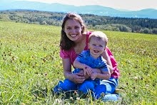
Here is my before picture. I love this picture of my husband and my son. I love Bradley holding on to his Daddy's shirt and looking so happy in his arms. I love that David's eyes are closed as if he is full of so much love for his son.
I took this with my point and shoot camera. I posted about this day trip we took here, in September.
I took this with my point and shoot camera. I posted about this day trip we took here, in September.

This is my edit. I love the rounded corner look so I moved the "Amount" in Highlighting priority, under "Effects", all the way to the right. Then, the three underneath, I moved all the way to the left.
I made the Temperature warmer and I moved the Tint slightly to the left. Then, I moved Saturation almost all the way to the left and I bumped up the Vibrance and Clarity.
I also moved the Lens Vignetting all the way to the left and played with the Tone Curve to make it a little brighter.
 That second picture was my personal edit. I played around with the settings in LR Beta 3, until I saw something I liked. I'm not entirely happy with it. I think my son's face has a little too much pink in it and his hair is a little green, but I had a hard time trying to figure that out.
Here is another edit. I gave the picture rounded corners using Gimp. Then, I used a preset from Preset Heaven.
It appears that I cannot get rid of that black rectangle around my photo when I round the corners. I tried Highlighting priority with Lightroom, above, and then with Gimp, below. Any suggestions how to round corners without the black edge?

Here is an edit with a preset that I downloaded from Preset Heaven.
I really like this look.

That was fun. I love this photo of David and Bradley. I think I like the second edit better, the downloaded preset with curved corners from Gimp, what do you think?

I made the Temperature warmer and I moved the Tint slightly to the left. Then, I moved Saturation almost all the way to the left and I bumped up the Vibrance and Clarity.
I also moved the Lens Vignetting all the way to the left and played with the Tone Curve to make it a little brighter.
 That second picture was my personal edit. I played around with the settings in LR Beta 3, until I saw something I liked. I'm not entirely happy with it. I think my son's face has a little too much pink in it and his hair is a little green, but I had a hard time trying to figure that out.
Here is another edit. I gave the picture rounded corners using Gimp. Then, I used a preset from Preset Heaven.
It appears that I cannot get rid of that black rectangle around my photo when I round the corners. I tried Highlighting priority with Lightroom, above, and then with Gimp, below. Any suggestions how to round corners without the black edge?

Here is an edit with a preset that I downloaded from Preset Heaven.
I really like this look.

That was fun. I love this photo of David and Bradley. I think I like the second edit better, the downloaded preset with curved corners from Gimp, what do you think?










Bradley is sooo sweet! Great edits. :-)
ReplyDeleteOh that just made me smile! Kim
ReplyDeleteOh, so precious! You did a great job!
ReplyDeleteSuch a sweet shot...you got to love Preset Heaven!
ReplyDeleteWhat a cute little boy! :) These look GREAT! I love the third one!
ReplyDeleteI like the first two edits best. What a precious photo!
ReplyDeleteThat is such a sweet photo. I just love the emotion in it. Honestly I love your first edit the best. I think the preset blew out your little darling's face too much. I also like your tight crop in the first one. It focuses more on the faces. I think you did awesome on your own! I wish I could help with the rectangle around your photo, but I cannot! Sorry!
ReplyDeleteI am far from an expert. But the first edit is most pleasing to my eye.
ReplyDeleteThe black rectangle is just what blogger does.
Hey girl! It looks great! The black border is something that is added automatically to all pictures in blogger. It's also around your rectangle shaped pictures. It's just harder to see. To get rid of it you have to edit your html. ...or does it look that way when you save it in gimp?
ReplyDeleteYour edits are beautiful. Love them all. xx
ReplyDeletecute pic!!!
ReplyDeleteGoodness! Your little Bradley is cute as a button! What a cuddle bug!
ReplyDelete& I am impressed with your editing skills. As for me, if I can get my photos on my posts, I am thrilled! (Thank goodness for winning a Roxio account, so that I am able to put some of our photos in little videos...if you get a chance to read through any old posts, you will notice a theme...computer-savvy-I am not :o) but slowly getting better.)
I do like your second edit, but also like the shadow effect of the third one. It really makes the photo look like it is sitting above the background.
Blessings & Aloha!
I like each of them. The second two have a more vintage feel. You captured such a sweet moment.
ReplyDeletei think i like your personal edit the best! that photo would also look so sweet in black and white, i think. gorgeous!!
ReplyDeletedo you know how to take out the green and unwanted stuff in lightroom just on the parts you select? email me..I can help!
ReplyDelete